Art Basel: Beauty is in the eye of the beholder
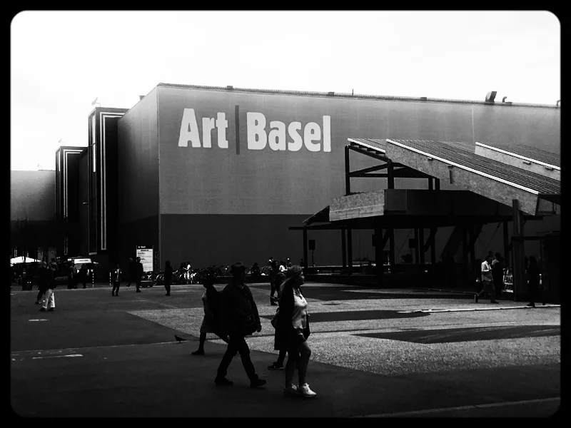
A few days ago, I went to Basel with my brother to mingle with snobby art lovers at the Art Basel fair. We first checked out the DesignMiami/ portion, which was exceptional. Seeing as our great uncle, Vico Magistretti, was a talented Italian designer and architect, we always appreciate the esthetics and beauty of refined, modern furniture. One section I particularly enjoyed was Calvin Klein’s installation, which featured a wooden barn and limited edition Cassina Feltri armchairs. CK's creative director, Raf Simons, refurbished them with beautifully colored quilts.
The design part of the exhibit was great for me as it was well-lit (well, except for the disco installation!) and spacious, so I didn't trip or bump into things -- plus my brother was there. If you want to enjoy an exhibit as a visually impaired person, it really does help to have someone with you whom you trust and are comfortable with.
The art section was a bit trickier for me as it was way more crowded and there was a lot to take in visually. Modern art can indeed be overwhelming with the mix of colors, patterns, lighting and media. So trying to enjoy the exhibits while being extra careful not to trip over a million dollar piece of art is a tricky exercise! I almost did trip over a white block on the white floor (thank God my brother caught me).
Some of the things that caught my eye were paintings or illustrations of, well, eyes. Here are a few shots I took:
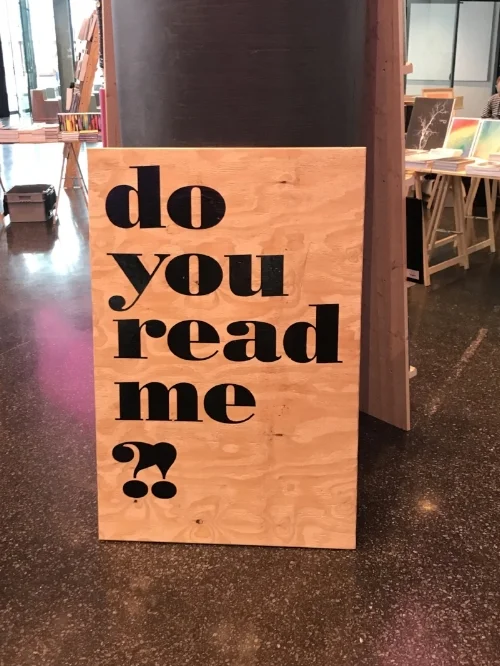
One of the things that I do like about modern art is that it is often big and bold, including the fonts. Below is an example of something that I could actually read (notice how trendy the Silicon Valley jargon is):
So the best art exhibits are the ones that are spacious, well-lit and not too crowded. After all, the point is to enjoy the experience :)
#NeverLoseSight


